

.png)
Here's a simple test. Show your product to someone unfamiliar with it. Ask them: "Which part looks embedded?"
If they point to the dashboards instantly, you have a problem.
Your customers don't want "access to reports". They expect analytics built into your product. Not a redirect. Not a separate login. Not a BI portal wearing your logo. Built in.
White-labeling is one of the most scalable and practical ways to ship analytics. When implemented deeply, it allows you to deliver enterprise-grade reporting without building a second product from scratch. The challenge isn't white-labeling itself, it's stopping at surface-level branding instead of making analytics feel truly native. When execution falls short, users notice. Enterprise buyers notice. And it can quietly weaken your product's perceived maturity.
This article breaks down what white-label analytics actually means, why basic branding falls short, and exactly how to make analytics feel truly native the kind where users never think "oh, this is the analytics tool" because it just feels like another screen in your product.
For a broader foundation (multi-tenancy, governance, and embedding models), see the embedded analytics guide.
What Is White-Label Embedded Analytics?
White-Label embedded analytics means integrating a third-party analytics engine into your product and presenting it as your own. Your users see dashboards, charts, and reports inside your app not inside a separate BI tool.
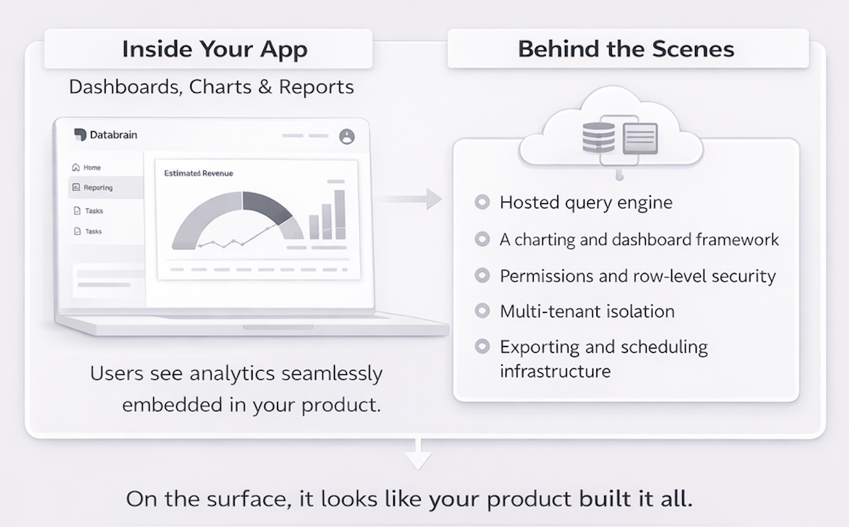
Under the hood, you rely on:
- A hosted query engine
- A charting and dashboard framework
- Permissions and row-level security
- Multi-tenant isolation
- Exporting and scheduling infrastructure
On the surface, it looks like your product built it all.
In practice, this usually involves:
- Embedding dashboards via SDK or iframe
- Applying your logo, colors, and typography
- Connecting authentication so users don't log in twice
Done right, you ship analytics in weeks instead of quarters. Done wrong, it looks like you pasted a reporting tool into your UI.
Why SaaS Products Use White-Label Analytics Instead of Building Their Own
Building analytics from scratch sounds appealing until you list what it actually requires.
At minimum, you're signing up for data modeling for evolving datasets, performance optimization at scale, role-based permissions and row-level security, dashboard builders and flexible visualization layers, scheduling and exports, multi-tenant data isolation, and UX that doesn't feel clunky.
That's not a side feature. That's the second product.
White-label embedded analytics lets you ship faster, reduce engineering lift, match enterprise expectations, and focus on core workflows instead of BI infrastructure.
In many enterprises today, embedded analytics is no longer optional. It's assumed. The question isn't "Should we offer analytics?" It's "Will it feel like our product?"
The Real Problem: Cosmetic White-Labeling Isn't Enough
Here's where most teams get it wrong. They equate white-labeling with branding.
That usually means uploading a logo, picking a primary color, and setting a font. That's not native integration. That's surface paint.
When most vendors say "white label," they deliver branding not a native experience. But true white-label analytics goes beyond logos and colors:
- Charts use generic blues and grays instead of your brand palette
- Card borders and shadows don't match your product components
- Analytics buttons and menus behave differently from the rest of your UI
- System copy says "Token invalid" instead of speaking in your tone
- Filters show odd presets like "Yesterday" when your teams care about "This quarter"
iFrame-based embeds compound the problem. They create visual seams between your application and the analytics layer. Subtle differences in scrolling behavior, typography rendering, and interactive patterns break the immersion. Users feel like they've stepped into a different product, even if they can't articulate why.
The 3 Layers of Native Embedded Analytics
If you want analytics to feel like it belongs, you need alignment across three layers.
Layer 1: Surface Layer (Visual Alignment)
Do your dashboards match your design system? This means typography, spacing, border radius, card shadows, layout grids, and chart color palettes all need to align.
If your product uses soft neutrals and rounded cards, but your dashboards use generic blues and sharp corners, the illusion breaks instantly. Visual mismatch signals: "This was added later."
Instead of treating themes as a superficial skin, deep white-labeling lets you align analytics views with your design system at the component level. Card styling matters more than most teams realize. When metric tiles use different padding, corner radius, or shadow depths than your native cards, the visual inconsistency registers subconsciously.
Layer 2: Interaction Layer (Behavior & Permissions)
Does analytics behave like the rest of your product? Do filters match your business logic? Are date presets aligned with billing cycles or fiscal quarters? Do roles and permissions mirror your app's access model? Do interactions follow the same UX patterns?
If your app talks in "billing cycles" but dashboards default to "Yesterday," you've created cognitive friction. Behavioral mismatch is where adoption quietly drops.
Consider a typical SaaS with multiple customer segments. You might want to offer read-only dashboards for end customers with no metric creation or layout customization. Sales teams might get layout editing and custom metric creation. Product teams could unlock scheduled email reports and underlying data access. If your analytics embed shows the same capabilities to everyone, you're either overwhelming entry-level users or hiding value from users who've paid for advanced features.
Layer 3: Trust Layer (Security & Isolation)
This is where enterprise buyers pay attention.
White-label embedded analytics in SaaS must support:
- Domain whitelisting: embeds only render on approved domains
- IP whitelisting: database traffic only from known IP ranges
- Tenant-aware tokens: users only see their own data
- Row-level security: granular control over which rows each user can access
- HTTPS everywhere
If your embed model can't handle secure isolation between customers, it won't survive procurement review. Native isn't just visual. It's operationally invisible.
Why Native-Feeling Analytics Impacts Revenue
When analytics feels bolted on, feature adoption drops, self-serve exploration declines, support tickets increase, and champions struggle to justify renewal.
For many companies, analytics justifies higher pricing tiers, drives upsell conversations, and supports expansion into enterprise accounts. If your reporting experience feels second-class, your product narrative weakens.
Strong embedded analytics platform says: "We are a mature platform." Shallow integrations say: "We integrated something." That difference shows up in expansion revenue.
Why Not Just Send Users to a Separate BI Tool?
Because context matters.
Sending customers to a separate BI portal breaks workflow continuity, forces additional authentication, reduces product stickiness, and separates insight from action.
When analytics lives inside your product, users can analyze, decide, and act without leaving your environment. That's the difference between reporting and embedded intelligence.
How to Make White-Label Embedded Analytics Feel Native using Databrain
Databrain is built for teams that want analytics to disappear into the product and not stand out as a separate tool. You get fine-grained control over three big pillars:
- Visual Theming and Layout
- UX and Interaction Customization
- Localized Copy, Messages, and Empty States
All of this can be configured per embedded dashboard or even per metric, so you can tune the experience to each surface inside your app.
Visual Theming That Mirrors Your Design System
If your product already uses a dark navy background with teal CTAs and slightly rounded cards with soft shadows, you shouldn't be manually recreating that in a separate analytics designer.
Databrain lets you apply theme names and admin theme options directly from your existing UI theming panel, so dashboards automatically inherit the same background, CTA colors, and card styles your product already uses.
Then go granular. Card styling matters more than most teams realize. When metric tiles use different padding, corner radius, or shadow depths than your native cards, the visual inconsistency registers subconsciously. Databrain lets you adjust card padding, radius, and shadows to make metric tiles visually indistinguishable from your own components. If your product uses a flat, minimalist aesthetic, you should be able to hide chrome elements like metric card borders, card shadows, dashboard names, loaders, and full-screen buttons entirely.
Charts are often where embedded analytics expose their origins. Default palettes, clashing fonts, and generic legends all scream "third-party tool".
Databrain supports deep theming, which means controlling custom chart color palettes via dedicated configuration (like chartColors) so lines, bars, and areas use your brand colors. It means configuring chart appearance details: tooltip typography, label positions, margins, legend position and orientation, axis fonts and colors. When your revenue trend chart looks like a visualization your design team created, you're reinforcing brand trust with every interaction.
Controlling UX and Interactions Per Tenant
A native analytics experience isn't just about appearance, it's equally about what users can do and how much complexity they see.
The solution is granular control over dashboard actions and editing affordances. You should be able to independently toggle capabilities like creating, updating, or deleting metrics, customizing dashboard layout, managing metrics, scheduling email reports, and viewing underlying data.
Each toggle lets you map analytics capabilities to your pricing structure precisely, turning analytics into a packaging and upsell lever while keeping the UX focused for users who just need answers.
Small interaction details matter too. Consider the options menu icon the same three-dot pattern that appears throughout modern interfaces. If your product uses that pattern, your analytics should too. The result is a UX that feels like a continuation of your existing product patterns, not a switch into a separate tool.
Scheduled Reports from Your Custom Domain
Native analytics doesn't stop inside your application. It extends to how insights are delivered outside of it.
Scheduled reports are a critical part of enterprise workflows. Finance teams, executives, and operators rely on automated dashboards delivered via email. If those emails come from a third-party domain or redirect users to an external analytics portal, the embedded experience immediately breaks.
With Databrain, scheduled reports can be sent directly from your custom domain, ensuring complete brand continuity.
When users share or schedule reports:
- Emails are sent from your configured domain
- Links resolve within your application URL
- The experience feels fully native, not vendor-powered
- Tenant-aware access and role permissions remain enforced
This ensures analytics feel embedded everywhere, including the inbox.
Localized Copy, Messages, and Empty States
Even beautifully themed analytics can break immersion if the language feels off.
System messages create some of the most jarring disconnects. A generic token expiry message like "JWT expired" sounds like a developer error, not a user-facing message. Compare that to "Your analytics session has ended, refresh to continue."
Custom messages for token expiry, missing tokens, and permission issues let you align with the tone of voice users expect from your product.
Internationalization goes beyond translating interface labels. Metric names need localization too. A translation dictionary that maps your terminology into supported languages combined with a language prop for per-tenant or per-user localization ensures dashboards show up in the correct language automatically.
Empty states reveal whether embedded analytics truly integrates with your brand. When a chart has no data, generic platforms show a blank grid or a standard "No data found" message.
Databrain shows your custom illustration via SVG configuration the same style your product uses for empty inbox states or no-results search pages. Friendly copy like "No data yet. Try expanding your date range or adjusting filters" keeps the experience consistent in moments where users most need guidance.
Date and filter presets demonstrate sophisticated localization. If your product operates on quarterly business reviews, the default date range should be "This Quarter," not "Last 7 Days." If your business never analyzes daily data, remove "Yesterday" from date picker options entirely.
Is White-Label Embedded Analytics Secure for Multi-Tenant SaaS?
Yes, if implemented correctly.
Embedded analytics platforms support token-based user scoping, strict tenant isolation, row-level security, and infrastructure-grade encryption.
Domain whitelisting ensures dashboards only render on the domains you explicitly trust your production app and necessary staging environments for QA. Avoid wildcard configurations that allow any domain, as they expose your analytics to unauthorized embedding.
Combined with IP whitelisting for database connectivity and tenant-aware token integration, this reduces risk even if a token is exposed. The dashboard simply won't render on unauthorized hosts, adding a layer of protection beyond token validation alone.
Implementation Blueprint: From Generic Embedded BI to Native Analytics
If you're running a SaaS product and currently embedding dashboards that feel "just okay", here's a practical blueprint to upgrade that experience.
Step 1: Connect Data Sources Safely
Configure database connectivity using IP whitelisting, so your data warehouse only accepts traffic from known IP ranges. Validate this in your lower environments first, then mirror the setup in production.
Step 2: Configure Domain Whitelisting and Tokens
Define your allowed embed domains such as production app domains and necessary staging/preview domains for QA. Avoid wildcard * that allows any domain. Ensure HTTPS is enforced in production. Integrate your guest or auth tokens so dashboards only render in your intended host app.
Step 3: Apply Themes, Chart Palettes, and Chrome Settings
Map your existing design system tokens (colors, typography, spacing) into your analytics theme. Configure card padding, radius, shadows, dashboard background and CTA colors, chart color palettes and legend/axis styles.
Hide visual chrome like card borders, shadows, dashboard names, loaders, and full-screen buttons wherever you want analytics to "disappear" into the page.
Step 4: Set Up Role-Aware Actions and Filters
Define which actions are visible for each role like read-only vs editable dashboards, ability to create/update metrics, layout customization, email scheduling and underlying data access.
Configure global and metric-specific filter presets so each embedded view opens with meaningful defaults and uses date ranges and labels that match your product's mental model.
Step 5: Localize Copy, Messages, and Empty States Before Launch
Integrate your translation dictionary for key terms and metric labels. Customize token expiry and access messages plus generic system messages that appear within analytics.
Configure "no data" illustrations and copy that match your brand's empty-state patterns. Test across languages and regions, including calendar-type behavior, so analytics feels native to every audience you support.
Native UX Checklist for Evaluating White-Label Analytics
If you're comparing vendors or modernizing an existing embedded BI stack, use this checklist to assess how "native" their experience can really be.
Visual depth:
- Can you control card padding, radius, shadows, and background per dashboard?
- Can you hide chrome like borders, titles, loaders, and full-screen buttons for a flat, native look?
- Can charts reuse your brand palettes and typography across legends, axes, and tooltips?
Interaction control:
- Can you selectively expose actions like create metric, edit layout, schedule emails, and view underlying data per role?
- Can you align options menus and interaction patterns with your app's existing conventions?
Localization and language:
- Can you customize all system messages like token expiry, access errors, generic errors to match your tone?
- Can you localize metric labels and analytics copy per tenant or per user via a translation dictionary?
Filters and regional behavior:
- Can you predefine filter presets and default date ranges that reflect your business concepts?
- Can you hide unused date options and adapt calendar behavior for specific regions?
Security and embedding:
-
- Can you whitelist only specific domains where dashboards render?
- Does analytics stay protected if a valid token is exposed outside those domains?
If a platform can't check these boxes, you'll end up with something that looks "sort of" like your app but never truly feels native.
The Bottom Line
White-label analytics is a powerful strategy but it should mean more than just swapping logos. It should mean analytics that your users believe you built yourself because every detail, from card shadows to calendar types, tells them exactly that.
Shipping analytics is easy. Making it feel like it belongs? That's where real product maturity shows up.
Your users may not know the term white-label analytics. But they know when they've left your product. The goal is to make sure they never feel that way.
Databrain is designed to meet these criteria out of the box and explore the full configuration options to see how granular the control goes.
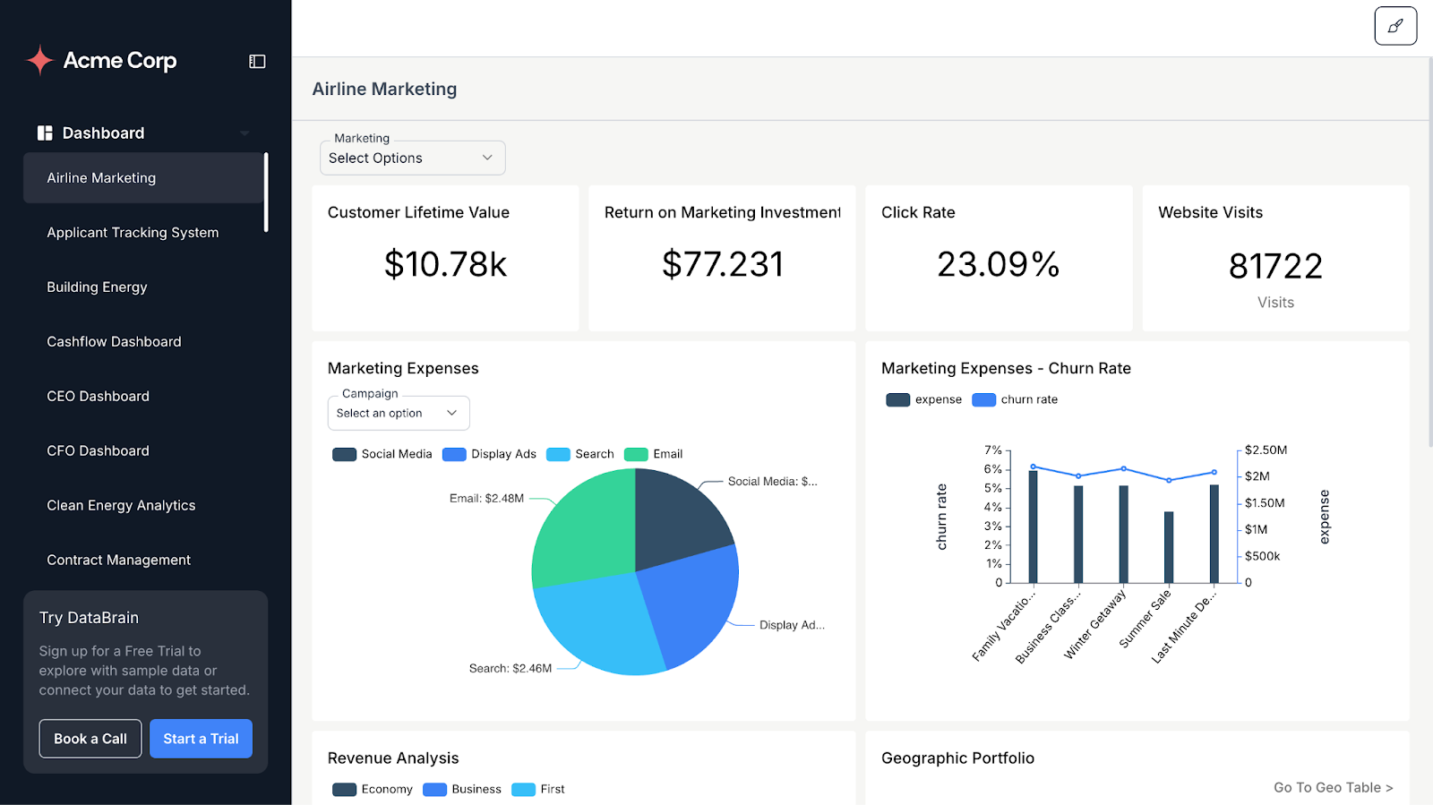
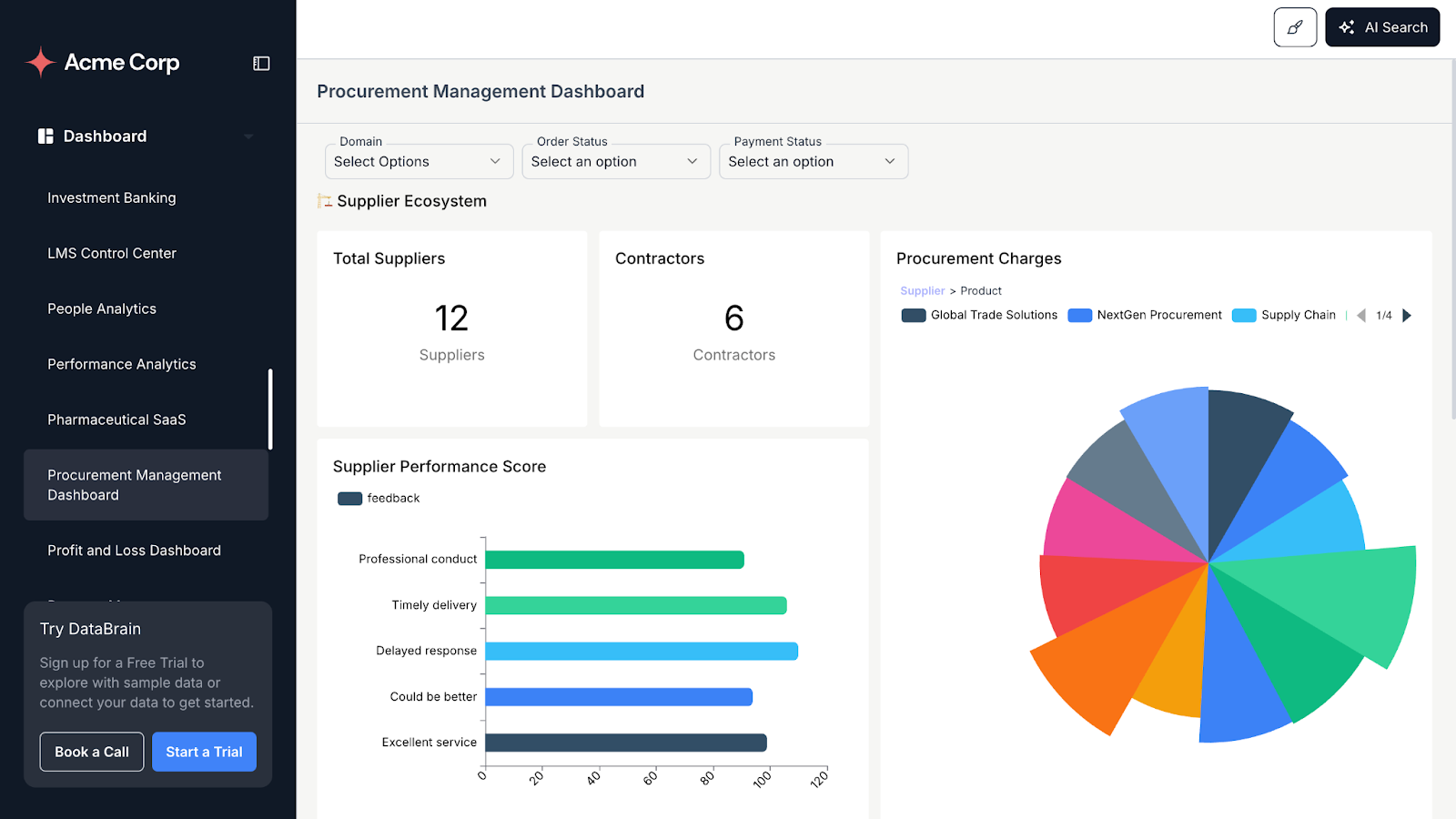
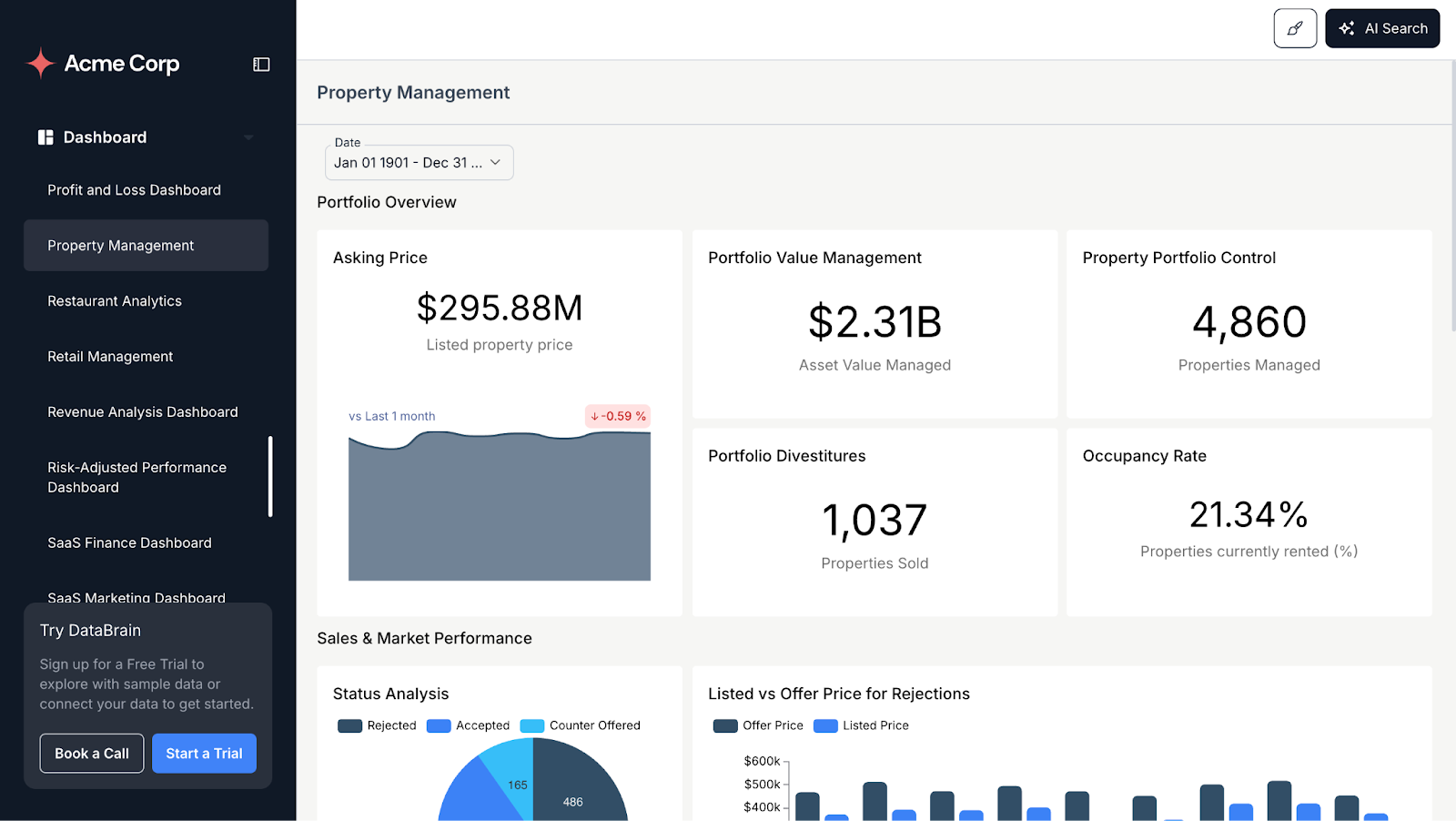
Here are a few sample dashboards created and embedded using Databrain:
Ready to run the reality test?
Show your product to someone unfamiliar with it. Ask which part looks embedded. Then schedule a demo with Databrain to see how your analytics could score and what it would take to make your dashboards disappear into your product completely.
Frequently Asked Questions
What is white-label embedded analytics?
It’s a third-party analytics engine integrated into your product and fully rebranded as your own. Users see dashboards, charts, and reports inside your app with your logo, colors, and domain while a specialized platform handles the infrastructure behind the scenes.
How does white-label embedded analytics work?
You connect your data source to the analytics platform, embed dashboards via SDK or iframe, and apply your branding. Authentication ties into your existing login so users don’t sign in twice. The platform handles the query engine, visualizations, permissions, and multi-tenant isolation.
What's the difference between white-label branding and native-feeling analytics?
Basic branding changes logos and colors. Native-feeling analytics goes further by matching layouts, interactions, language, and security: aligning card styles, filters, date behavior, system messages, empty states, and domain-level access rules so analytics behaves like any other screen in your app.
What is the difference between white-label analytics and embedded BI?
Embedded BI is any business intelligence content surfaced inside another application, often still visibly tied to the BI vendor’s brand and UX. White-label analytics is a subset of embedded BI where the analytics experience is fully rebranded—your domain, your colors, your navigation—so customers experience it as “your analytics.”
How do I make embedded analytics feel native to my product?
Align three layers: Visual (match your design system), Interaction (filters and permissions), and Trust (domain whitelisting, row-level security, tenant isolation). Most “white-label” solutions only cover the first layer.


