
Financial Dashboards: A Comprehensive Guide for Better Financial Management
Financial dashboards provide real-time updates, improve decision-making, and enhance risk management. Learn key types, design principles, and visualization tips to optimize your financial performance.

.png)
Key Takeaways
- A financial dashboard pulls your revenue, expenses, cash flow, and margins into one real-time screen. No more digging through spreadsheets or waiting on month-end reports.
- There are 8 main types from CFO executive dashboards to SaaS-specific ones tracking MRR and churn. Pick the one that matches your actual decisions. (See all 8 with examples here.)
- Stick to 5-8 KPIs. Forty metrics on one screen isn't a dashboard. It's a mess with better fonts.
- Design for the question, not the data. If nobody opens it, it doesn't matter how pretty it looks.
Most finance teams are still making million-dollar decisions based on spreadsheets someone updated last Tuesday. Meanwhile, the data already existed to flag the problem two weeks ago it was just trapped in six different tabs nobody reconciled.
A financial dashboard fixes that. One screen. Real-time numbers. No more guessing, no more stale reports landing in inboxes three days too late. And the gap between teams running on live dashboards and ones still stitching together Excel tabs at month-end? It's getting wider every quarter.
The financial analytics market is on pace to cross $11.86 billion in 2026, growing at 11% year over year. That growth isn't hype, it's finance teams getting tired of being the last ones to know what their own numbers look like.
This piece breaks down the types of financial dashboards that actually drive decisions, the KPIs worth tracking, design choices that separate useful dashboards from expensive wallpaper, and how to pick the right tool for your situation.
What Is a Financial Dashboard, Really?
A financial dashboard is pretty simple once you stop overcomplicating it. It's one screen that shows you how your money is moving. Revenue coming in. Cash going out. Margins holding or slipping. All updating live, all pulling from your actual data sources.
How is that different from the spreadsheet your finance team already maintains? Three things. First, a dashboard connects directly to your data sources: your ERP, accounting software, CRM, payment systems so numbers update automatically. No manual entry, no version control nightmares. Second, it uses data visualization for finance in a way that makes patterns obvious. A line chart showing cash flow dipping over four consecutive weeks tells a story that a column of numbers in Excel never will. Third, dashboards are shared by default. Everyone from the controller to the founder sees the same financial performance dashboard at the same time.
The old way? Someone on the finance team spends two days building a report in Excel. By the time leadership reads it, half the numbers are stale. Dashboards kill that lag. They give CFOs, controllers, FP&A folks, and founders a shared view of reality, not someone's interpretation of a spreadsheet from last Tuesday.
If you've used a fitness tracker, you already understand the concept. Except instead of tracking steps, you're watching burn rate.
Why This Matters More in 2026 Than It Did Two Years Ago
The short answer: there's more data, more speed, and less tolerance for surprises.
According to Precedence Research, the AI in data analytics market is projected to grow from $40.3 billion in 2026 to $310.97 billion by 2034. Financial forecasting, expense management, and real-time reporting are where that investment is landing hardest. If your competitors are making decisions with AI-powered business intelligence finance tools and you're still waiting on monthly reports, that's not a style difference. That's a speed disadvantage.
Real-Time Financial Visibility
You can see money moving in real time. Cash positions, revenue trends, expense spikes they show up as they happen. That matters when the difference between catching a liquidity problem early and scrambling to make payroll is about 72 hours.
Faster Decision-Making with Data
Your leadership team stops arguing about the numbers. When everyone stares at the same budget vs. actual variance chart, the conversation shifts from "what are the numbers" to "what do we do about them." That's a fundamentally different meeting. No more three-day back-and-forth to align on what the numbers even say.
Risk Management and Fraud Detection
Risk stops being something you discover after the fact. Debt-to-equity ratios creeping up? Customer credit scores dropping? A suspicious transaction that's way above your normal range? A good financial reporting dashboard catches those patterns while you still have options. You can set alerts for anomalies and investigate before the damage compounds.
Cross-Team Transparency and Accountability
Stakeholders stop asking you for reports. When the board, the department heads, and the investors can all look at the same dashboard, you stop playing telephone with financial information. That alone saves hours every week. It also makes accountability concrete so everyone can see which departments are hitting targets and which ones aren't.
Regulatory Compliance and Audit Readiness
Auditors have less to complain about. A properly structured dashboard with access controls creates a built-in paper trail. Your compliance team will thank you. And when auditors come knocking, you've got timestamped, role-based access logs instead of a folder of emailed spreadsheets.
Types of Financial Dashboards: Which One Fits Your Problem?
Not every financial dashboard solves the same problem. The one your board needs is completely different from the one your AR team uses daily. Picking the wrong type or worse, cramming everything into one screen is how dashboards end up ignored.
The most common types finance teams actually rely on: CFO and executive dashboards for the bird's-eye view, cash flow dashboards for liquidity monitoring, P&L dashboards for margin tracking, budget vs. actual dashboards for spend control, AR/AP dashboards for collections, risk management dashboards for exposure tracking, SaaS financial dashboards for subscription metrics, and department allocation dashboards for budget-to-earnings comparisons. Related use cases include healthcare dashboards and marketing dashboards that pull financial data into industry-specific contexts.
Each one tracks different KPIs, serves a different audience, and answers a different business question. We broke down all eight with detailed metrics, use cases, and live examples in our financial dashboard examples guide worth reading if you're deciding which type to build first.
The bigger mistake isn't picking the wrong dashboard type. It's picking the right type and then loading it with the wrong KPIs. Which brings us to the next section.
But first three specialized financial management dashboards worth knowing about, especially if you're in lending, banking, or asset-heavy industries.
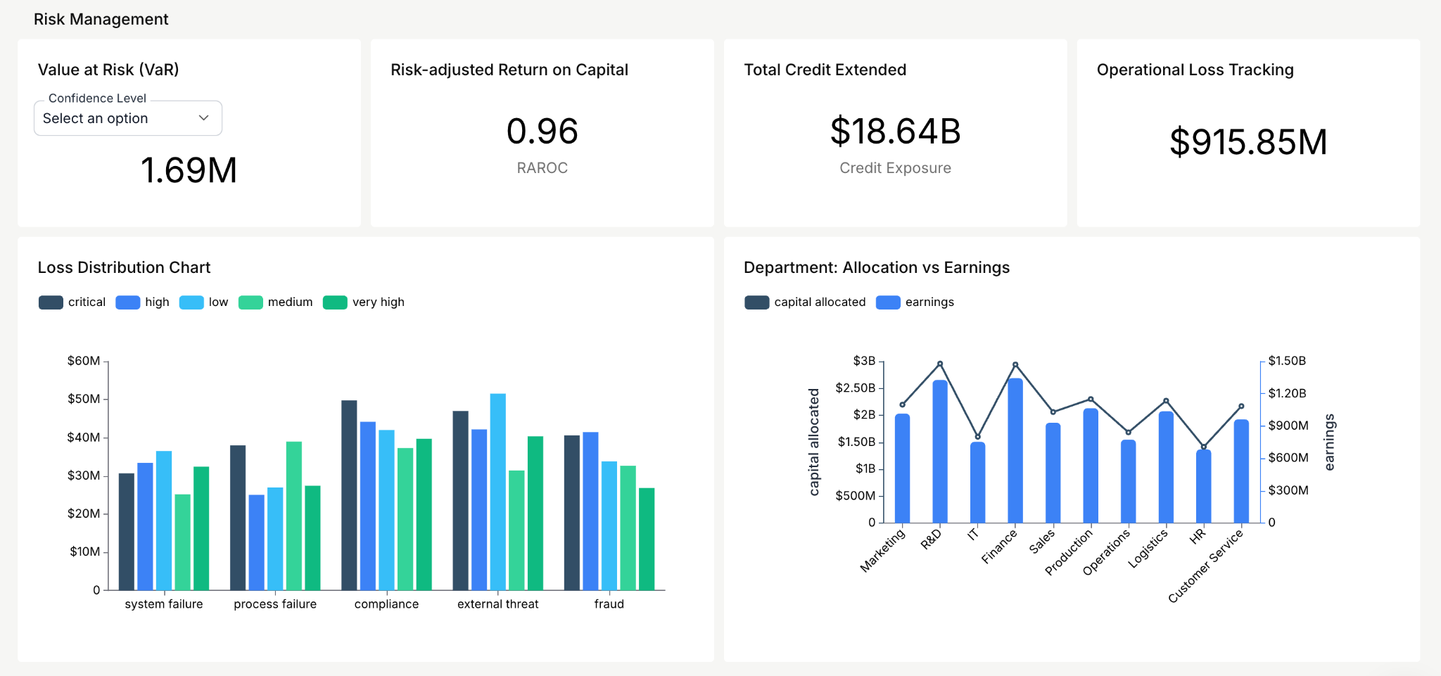
Risk Management Dashboard
This one gives you a live read on potential threats to your company's financial health. The core metrics: value at risk and risk-adjusted return on capital. If you're making lending decisions or managing a portfolio, this dashboard tells you where the exposure is building before it becomes a write-off.
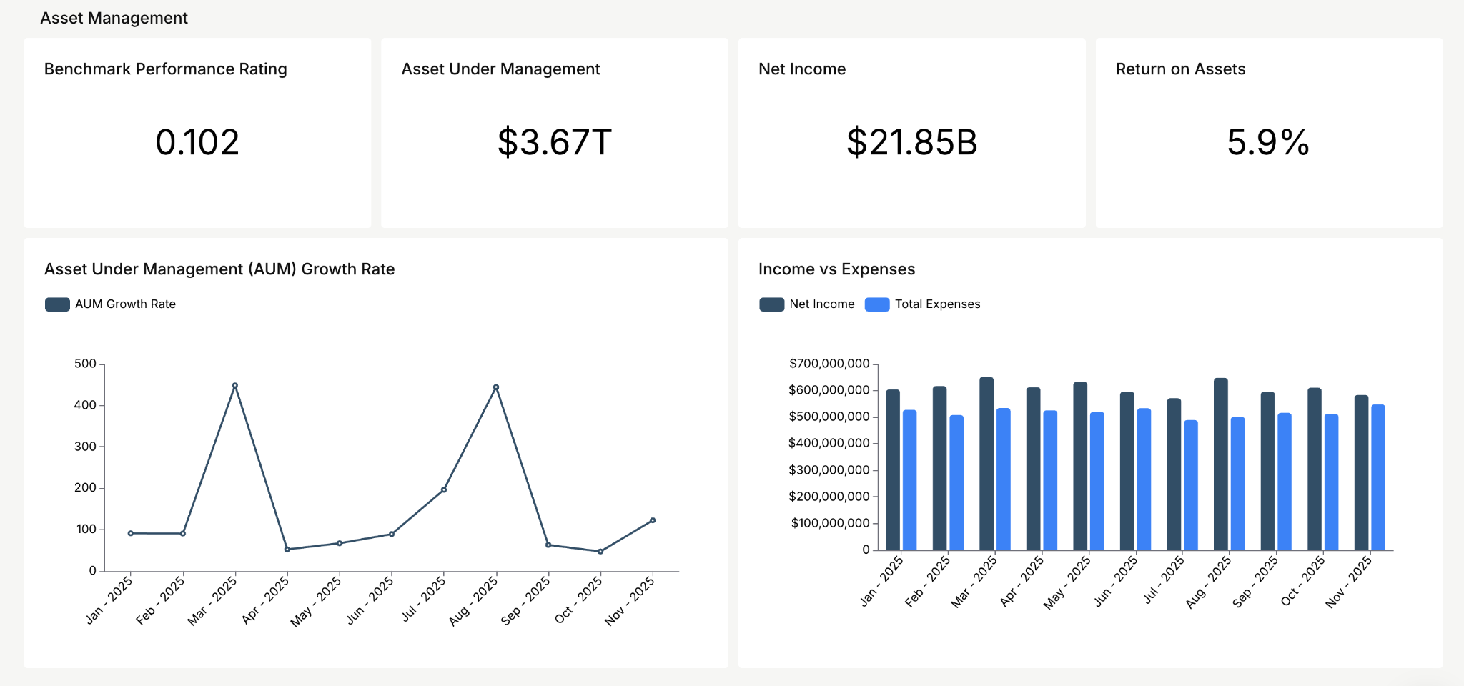
Asset Management Dashboard
Focused on how efficiently your organization puts its assets to work. The KPIs that matter here: return on assets and net income. Simple, but if those two numbers are trending in the wrong direction, nothing else on any other dashboard matters much.
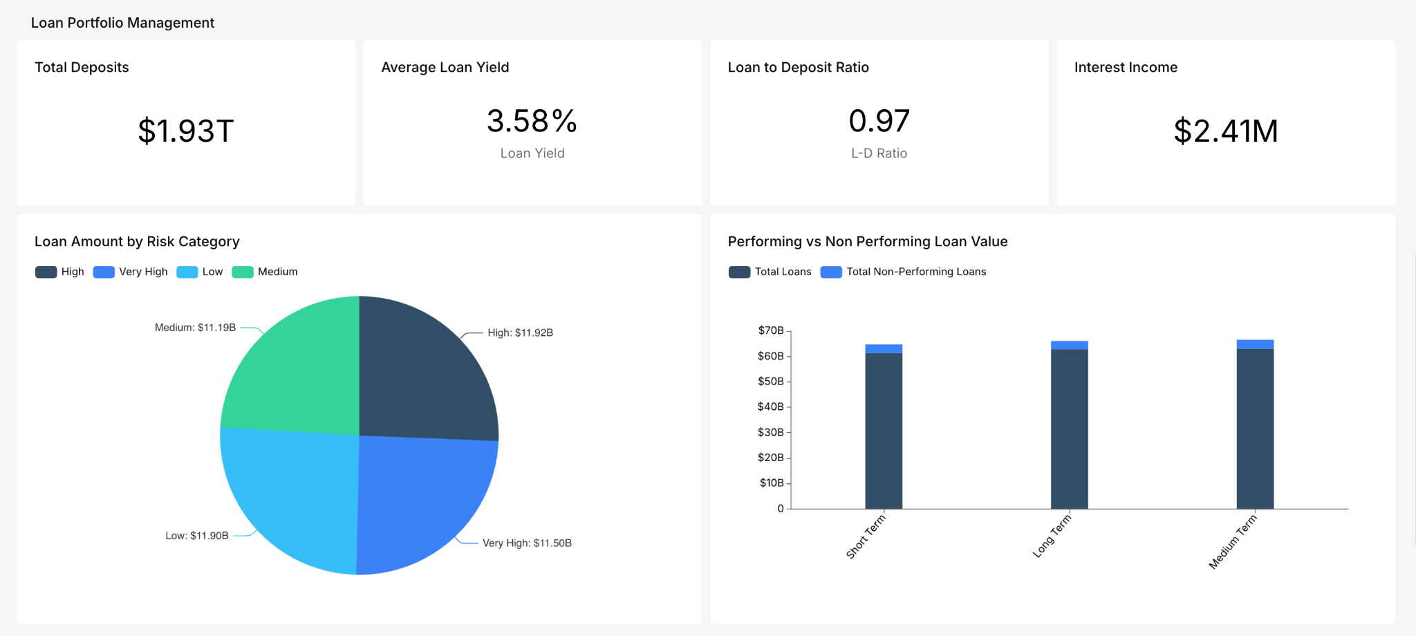
Loan Portfolio Management Dashboard
Tracks how your loan book is actually performing. Key metrics: average loan yield and interest income. If you're in financial services and you're not watching these in real time, you're reacting to portfolio risk instead of managing it.
These are just three of the many dashboard types available. For a complete breakdown with detailed KPIs and screenshots, check our financial dashboard examples article.
Key Financial Charts and KPIs in Action
Theory is useful. Seeing the actual data visualized is better. Here's a look at the key charts and KPIs from the Databrain finance dashboard and why each one earns its spot on the screen.
Charts
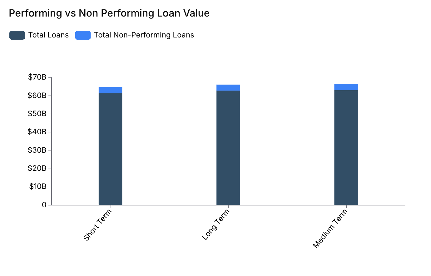
Performing vs. Non-Performing Loan Value
This chart compares performing and non-performing loans across short-term, long-term, and medium-term categories. A performing loan means the borrower is paying back on schedule and the full amount is expected. A non-performing loan means the borrower stopped paying and the lender might not recover the full amount. This breakdown helps you spot which loan terms carry the highest default risk so you can take action before the losses pile up.
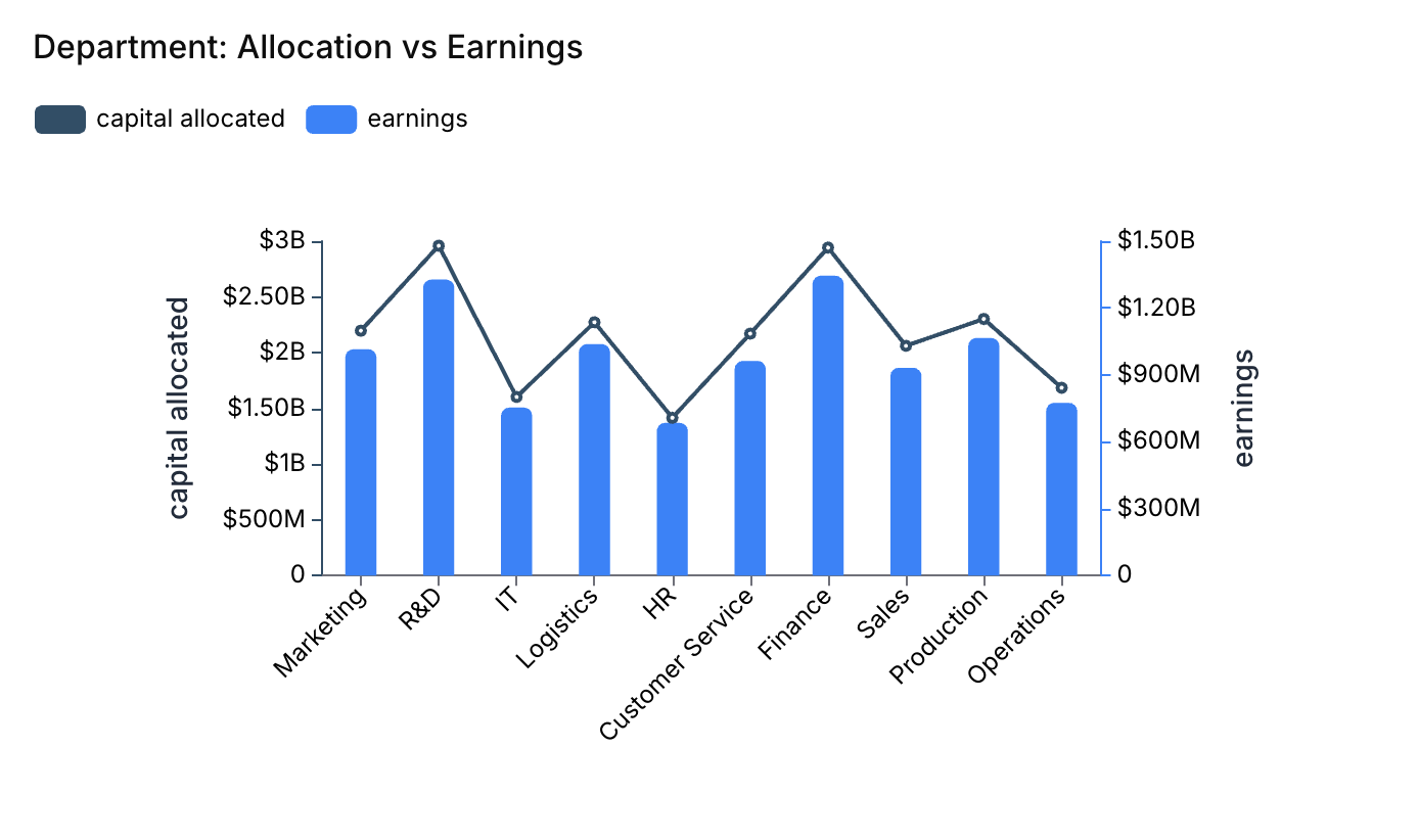
Department: Allocation vs. Earnings
Allocation is the budget a department gets to spend. Earnings are the revenue that the department brings in. For example, the finance department might get $100,000 for advertising and investment. The sales department might earn $500,000 from selling financial services. When a department earns more than its allocation, it's pulling its weight. When it earns less, there's a conversation to be had. This comparison helps leadership figure out where to put money next quarter.
KPI
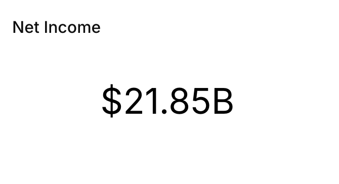
Net Income
Net income is what's left after you've paid every expense. Why does it belong on a dashboard? Because it tells you the overall health of your business at a glance. It drives decisions about spending and investing, and it feeds into nearly every other financial metric you track. If you only had room for one number on your dashboard, this would be a strong candidate.
These metrics are taken from the Databrain finance dashboard. Explore the complete dashboard and its functionalities here.
Which KPIs Belong on Your Dashboard? Depends on Your Business.
This is where people go wrong. They Google "financial dashboard KPIs" and dump every metric they find onto one screen. Don't do that. The right financial KPI dashboard is built around decisions, not data availability.
Universal Financial KPIs
Every business needs these on their dashboard regardless of industry: revenue (monthly + YTD), gross profit margin, net income, operating cash flow, working capital management metrics, EBITDA, and budget vs. actual variance. These are table stakes. If your dashboard doesn't start here, it's not a financial dashboard, it's a vanity project.
SaaS & Subscription KPIs
SaaS and subscription companies need to layer in MRR, ARR, churn rate, LTV/CAC ratio, burn rate, and net revenue retention. These SaaS financial dashboard metrics separate the companies growing sustainably from the ones just burning cash with nice charts. If you're running a subscription business and your CFO dashboard KPIs don't include these, you're missing the story your investors care about most.
E-Commerce KPIs
E-commerce should track average order value, contribution margin, inventory turnover, return rate, and customer acquisition cost by channel. Profit margin monitoring matters more here than top-line revenue, a company doing $10M in sales with 3% margins isn't in a fundamentally different position than one doing $1M with 30% margins.
Professional Services KPIs
Professional services need utilization rate, revenue per employee, project margin, pipeline value, and average billing rate. ROI tracking on client engagements is what separates firms that grow from firms that stay busy but flat.
Here's the rule of thumb that actually works: pick 5 to 8 KPIs your team makes real decisions with. If a metric sits on the dashboard for three months and nobody references it in a meeting, kill it. A dashboard with 40 numbers is just a spreadsheet wearing a suit.
Designing a Dashboard People Will Open More Than Once
Most dashboards die quiet deaths. Someone builds it, leadership says "looks great", and within six weeks nobody checks it. Here's the financial dashboard best practices that actually prevent that.
Start with a question, not a dataset. Before you touch a chart builder, answer this: what decision does this dashboard help someone make? Can't answer it? You're building decoration, not a tool. This is the most important financial dashboard design principle and the one most teams skip.
One page. That's it. The second someone has to scroll or click through tabs to find what they care about, you've lost them. Put the 5–8 metrics that matter at the top. Net income, cash flow, revenue those go above the fold, every time.
Color means something. Use it that way. Red for targets missed. Green for targets hit. Yellow for "keep an eye on this." Trend arrows and sparklines let people scan instead of read. A good financial dashboard communicates in five seconds flat.
Numbers alone are useless. Context is everything. Revenue of $2.4M means nothing by itself. Revenue of $2.4M vs. $2.1M last month vs. a $2.6M target now you have a story. Always pair metrics with comparisons: prior period, budget, target.
Pick chart types that match the data. Line charts for trends over time. Bar charts for comparisons across categories. Pie charts for showing simple proportions. Once you have more than three slices, a pie chart turns into a guessing game. Simplify data points weekly averages instead of daily noise.
Build for the phone. Your CFO will check this at the airport. During a meeting. In an Uber. If it falls apart on mobile, you lose your most important user.
Then test it. With actual humans. Ask three people to find a specific number on the dashboard. Watch where they click. Watch where they hesitate. Fix those spots. Version one is never the final version and that's fine.
How to Build a Financial Dashboard: Step-by-Step
Knowing what makes a good dashboard is one thing. Actually building one is where most teams stall. Here's the process that works whether you're using dashboard software like Databrain, Power BI, or even a cloud-based financial dashboard tool you haven't picked yet.
Step 1: Define Your Audience and Goals
Who's going to look at this dashboard daily? A controller tracking cash flow needs a completely different view than a VP watching departmental spend. Write down the top three decisions this dashboard should support. If you can't name them, you're not ready to build yet.
Step 2: Identify and Connect Data Sources
Map out where your financial data actually lives. ERP system? Accounting software like QuickBooks or NetSuite? CRM for revenue data? Payment processor for transaction-level detail? Your dashboard is only as good as the data feeding it. If sources are disconnected, fix that first otherwise you're visualizing incomplete information.
Step 3: Select KPIs and Metrics
Use the industry-specific breakdown from the section above. Pick 5-8 KPIs that directly connect to the decisions you defined in Step 1. Resist the temptation to add more. You can always expand later you can't un-clutter a dashboard that's already overwhelming people.
Step 4: Choose a Dashboard Platform
Match the tool to the job. Some platforms offer a financial dashboard template library to get you started quickly others expect you to build from scratch. Need an interactive financial dashboard embedded inside your SaaS product? That's an embedded analytics use case. Need internal reporting for your finance team? Power BI or Tableau. Working with a limited budget? Looker Studio. We cover the full comparison below.
Step 5: Design Your Layout
Put the highest-priority KPIs at the top. Group related metrics together. Use the design principles from the section above visual hierarchy, contextual comparisons, traffic-light colors. Keep everything on one page. If it doesn't fit on one page, you have too many metrics.
Step 6: Add Interactivity
Static charts are reports. Dashboards need drill-down capability click on a revenue number to see it broken down by product line or region. Add filters for date ranges, departments, and business units. This is what makes a dashboard a decision tool rather than a wall poster.
Step 7: Deploy, Monitor, and Iterate
Launch it. Watch who uses it and who doesn't. Ask users what's confusing, what's missing, and what they never look at. Remove what nobody touches. Add what people keep asking about. A financial dashboard that stays static for six months is already dying.
Financial Dashboard Mistakes to Avoid
Most of these seem obvious. Teams make them anyway. Here's what kills dashboard adoption faster than bad data.
Tracking too many KPIs. Twenty metrics on one screen doesn't make you thorough. It makes the dashboard unusable. If everything is important, nothing is. Stick to 5-8 and earn every slot.
Showing numbers without context. Revenue is up 12%. Compared to what? Last month? Last year? The target? A number without a benchmark is decoration. Every metric on your financial dashboard needs a comparison point.
Letting data go stale. A dashboard that updates monthly in a business that moves weekly is worse than no dashboard at all. It trains people to distrust it. Match your refresh rate to your decision-making speed. If you need a real-time financial dashboard, build one don't pretend a monthly snapshot does the same job.
Ignoring mobile. Over half of dashboard views happen outside the office. If your layout breaks on a phone screen, you've lost the people who need it most, the ones making decisions on the move.
Skipping user testing. The person who builds the dashboard is the worst judge of whether it works. Put it in front of three actual users. Watch them try to answer a question with it. The friction points will be obvious within five minutes.
These aren't edge cases. They're the top reasons financial dashboards get built, praised in a launch meeting, and then quietly abandoned. Avoiding them is the easiest competitive advantage you have.
Financial Dashboard Tools Worth Considering in 2026
Different tools for different jobs. Here's the honest breakdown.
Databrain: Built specifically for embedded analytics. If you run a SaaS platform and need to put financial dashboards inside your product for customers, this is the fastest path. Deploys in 2-4 weeks. White-label. Multi-tenant security baked in. AI chat assistant for plain-English financial queries. Best for: SaaS companies building customer-facing analytics. (See how Databrain compares to Power BI.)
Power BI: If your company already runs on Microsoft, this slots right in. Solid data modeling, decent visualization library, good enterprise controls. Best for: internal reporting at mid-size and large orgs.
Tableau: Still the heavyweight for data visualization depth. The learning curve is steep and the price tag matches, but the customization is unmatched if you have a data team that knows what they're doing. Best for: teams that need maximum flexibility.
Looker Studio: It's free, it connects to Google sources easily, and it gets basic financial dashboards done. Won't win any design awards. Best for: startups watching every dollar.
Embedding Financial Dashboards Inside Your Product
If you're building software that serves finance teams: accounting tools, ERPs, fintech apps your customers already expect financial reporting built in. They don't want to export data to another tool. They want answers inside your product. This is the embedded financial dashboard for SaaS usecase, and it's growing fast.
Building that from scratch? You're looking at months of engineering time on chart libraries, data pipelines, tenant isolation, and export features. Most teams underestimate this by about 3x.
The benefits of embedded analytics become obvious here; you skip all of that. You drop production-ready dashboards directly into your app. Users get interactive financial dashboard experiences: charts, drill-downs, and real-time KPIs without ever leaving your product. And you ship in weeks instead of burning a quarter on infrastructure.
What matters when picking an embedded solution: multi-tenant architecture so each customer only sees their own data. White-label options that match your brand. Real-time data connections no ETL lag. Self-serve exploration so users can filter and drill without filing support tickets. And enterprise-grade security: SOC 2, GDPR, role-based access.
Check the Databrain financial dashboard to see what embedded finance analytics looks like in practice.
Frequently Asked Questions
What is a financial dashboard?
It's a visual tool that shows key financial metrics: revenue, expenses, cash flow, margins in live charts on one screen. Pulls data from multiple sources so CFOs, finance teams, and founders get a single view of what's happening with their money.
What KPIs go on a financial dashboard?
Start with revenue, gross and net margins, operating cash flow, working capital, and budget vs. actual. SaaS companies add MRR, ARR, churn, and LTV/CAC. The right list depends on your industry and who's looking at the dashboard.
Can a financial dashboard work for a small business?
Absolutely. A financial dashboard for small business doesn't need 40 KPIs. Start with revenue, cash flow, net income, AR aging, and one or two metrics specific to your industry. Tools like Looker Studio (free) or Databrain (if you need it customer-facing) make it accessible without an enterprise budget.
What is the best financial dashboard software?
Depends on context. Databrain for embedded analytics inside a SaaS product. Power BI or Tableau for enterprise internal reporting. Looker Studio if the budget is tight. Pick based on your data sources, customization needs, and whether the dashboard is for your team or your customers.
How do I make a dashboard people actually use?
Design around decisions, not data. Keep it to one page, 5-8 KPIs, with clear context (vs. last month, vs. target). Use color for status. Build for mobile. And test it with real users, not just your own team.


